Niagara Bootstrap Buttons
- Drag n' Drop
- Binds to ORD value
- Renders in all major browsers
- Bootstrap V4 styling
- Multiple styles
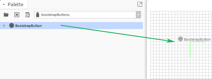
Bootstrap style buttons for your px pages. Drag and drop the icon widget from the palette onto your px view.
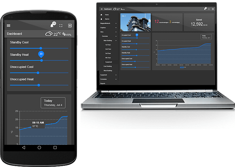
Are you looking for a cost effective way to manage and visualize data for all your customers? Why not have a look at View Builder?
Before you start. Download the modules from our portal (see your order confirmation, which also explains licensing). Copy the modules file to your modules directory. Restart BOTH station and Workbench.
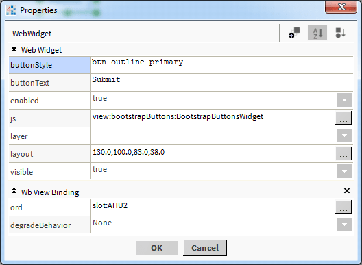
The widget has a number of configurable properties that can be used to modify look, feel, and functionality. Change the properties as required:
Main Ord:
The Niagara object the button points to.
Set this to an absolute ord, e.g.
station:|slot:/Drivers/NiagaraNetwork/AHU5
OR
relativized ORD e.g.
slot:AHU5
Button Text:
The button text to show on the button. You can also enter html character codes. E.g. non-breaking space:
Button
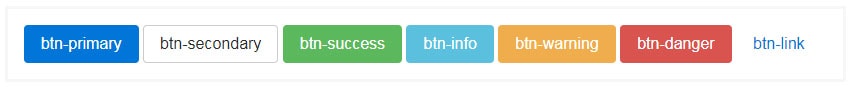
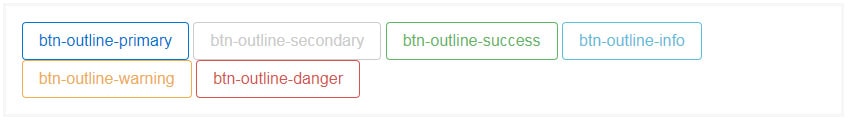
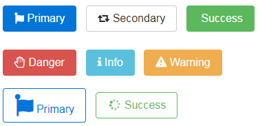
Button Style:
Bootstrap V4 - the following values are acceptable: btn-primary, btn-secondary, btn-success, btn-info, btn-warning, btn-danger, btn-link, btn-outline-primary, btn-outline-secondary, btn-outline-success, btn-outline-info, btn-outline-warning, btn-outline-danger.
Button Width:
Add a non-breaking space to either side by using
Button Examples:
Note: the buttons have a transparent canvas background in browser mode.
Also check out the font awesome buttons.
Build Your Own dashboards and win Projects by showing data that increase value and reduces expenditure.