Niagara PX Tooltip


  • Shows PX Page in a Tooltip
  • Change Style
  • Multiple Open Positions
  • Click or Hover Style tooltip
  • Works in Workbench and Modern Browser
Add to Cart
n4 hyperlink

Overview


The px tooltip widget allows you to show a px page as a tooltip. When the px page appears as a tooltip, you have full interaction of its content. This widget has multiple options such as position, style, click or hover, timing, etc. This widget works best in browser mode. Before you start, copy the .jar file to your modules directory. Restart the station and Workbench.

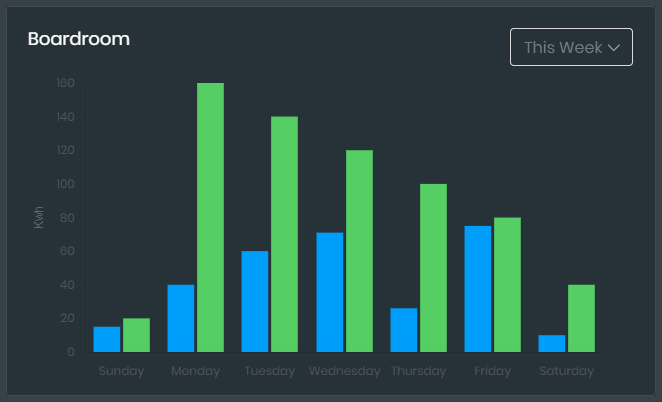
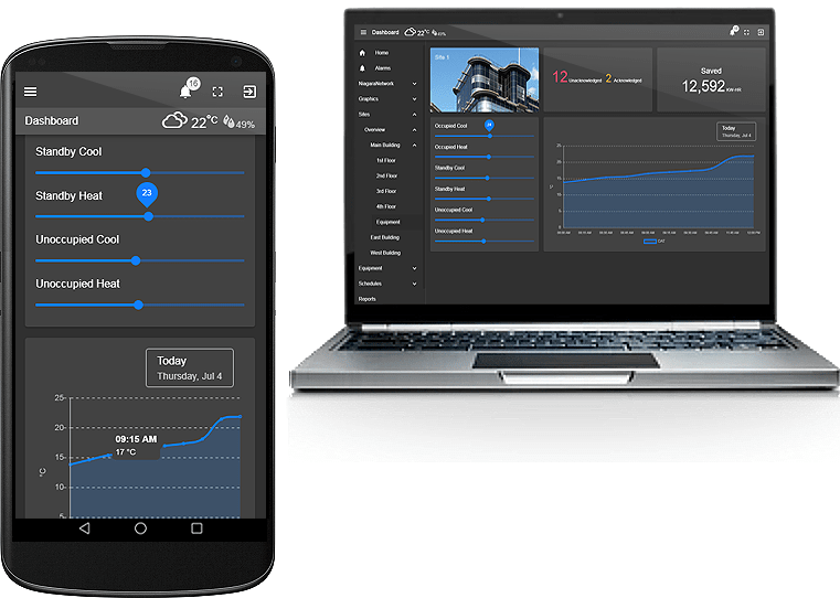
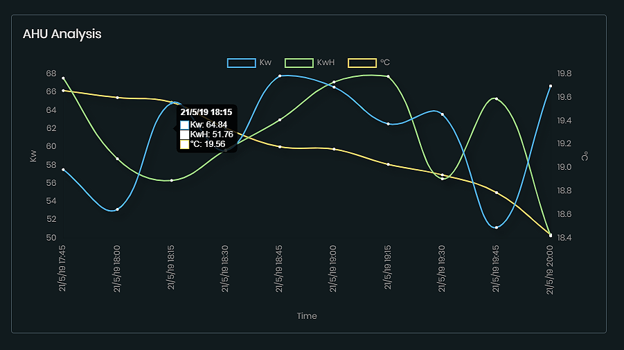
Are you looking for a cost effective way to manage and visualize data for all your customers? Why not have a look at View Builder?

Usage


Before you start. Download the modules from our portal (see your order confirmation, which also explains licensing). Copy the modules file to your modules directory. Restart BOTH station and Workbench.

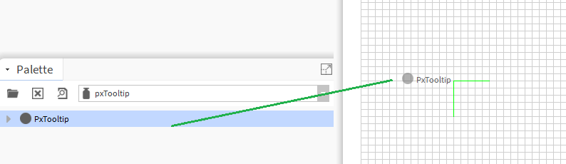
1. Copy the pxTooltip-ux.jar file to your modules directory.
2. Open the module from your palette file.
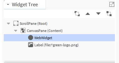
3. Drag and drop the widget from the palette onto your px view.

Tridium px page
Because the widget is transparent, it best to layer it in the widget properties as so:


Tridium px tooltip
Note: it won't appear in the px editor, but when you browse to it in browser you can see it is transparent. Or you can toggle the browser preview in workbench > 4.7. :
px tooltip


Properties


bms totals chart properties

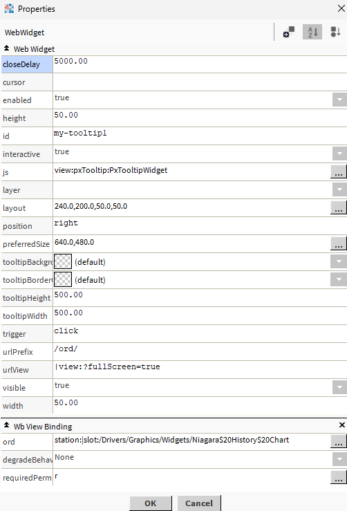
The widget has a number of configurable properties that can be used to modify look, feel, and functionality. Change the properties as required:

Ord:

You should bind this to an ord which has a px view on it. e.g. station:|slot:/Drivers/Graphics/Widgets/Niagara$20History$20Chart

Height, Width:

Size of the transparent box on screen. In pixels.

Tooltip Height, Tooltip Width:

When the tooltip appears on screen, the size it will appear. In pixels.

Trigger:

click or hover.

Id:

Change this if you have other px tooltips on the px page. This will allow them to have different colours etc.

Position:

Tooltip Position. Possible values are: right, left, top, top-right, top-left, bottom, bottom-right, bottom-left

Close Delay:

When the tooltip appears on screen, the delay before it closes by itself. In milliseconds. Default is 5000 (5 seconds)

Url Prefix:

This is the url we will load up for the tooltip. Default is /ord/
Note: depending on your niagara version, the url might vary slightly.

Url View:

This is the end part of the url. Default is |view:?fullScreen=true
Note: depending on your niagara version, the url might vary slightly.

Using in your HTML Page


You can now use the widget in your custom html page as long as the html file is in a appropriate station directory. E.g.:
C:/../station/shared/demo1.html

1. Create an html page and place in your station files directory.
2. Create a div element and give it an id so you can inject the widget into this area. E.g.: widget1.
3. Add the following scripts before the closing head tag or the closing body tag. E.g.:

    
        <script type="text/javascript">

            var require = {
                paths: {
                    //pointing nmodule at /module is a Niagara convention, allowing us to
                    //refer to module resources without having RequireJS get hung up on
                    //the use of absolute paths everywhere.
                    "nmodule": "/module",
                    "baja": "/module/bajaScript/rc/plugin/baja",
                    "bajaScript": "/module/bajaScript/rc",
                    "bajaux": "/module/bajaux/rc",
                    "lex": "/module/js/rc/lex/lexplugin",
                    "css": "/module/js/com/tridium/js/ext/require/css",
        
                    "jquery": "/module/js/rc/jquery/jquery-3.4.1.min",
                    "Handlebars": "/module/js/rc/handlebars/handlebars.min",
                    "Promise": "/module/js/rc/bluebird/bluebird",
        
                    // these are runtime dependencies
                    "hbs": "/module/js/rc/require-handlebars-plugin/hbs",
                    "i18nprecompile": "/module/js/rc/require-handlebars-plugin/hbs/i18nprecompile",
                    "json2": "/module/js/rc/require-handlebars-plugin/hbs/json2",
                    "underscore": "/module/js/rc/underscore/underscore",
                    "dialogs": "/module/js/rc/dialogs/dialogs",
                    "theme": "/module/themeZebra/ux/theme",
                    "pikaday": "/module/js/rc/pikaday/pikaday",
                    'log': '/module/js/rc/log/logPlugin',
                },
        
                hbs: {
                    disableI18n: true
                },
            }
        </script>
        <script type="text/javascript" src="/module/js/com/tridium/js/ext/require/require.min.js"></script>
        <script>
            require(['/module/pxTooltip/rc/pxTooltipWidget.run.js'], function (app) {
        
                app.initialiseValue({
                    divId: '#widget1',
                    cursor: 'pointer', // e.g. pointer, auto, help, grab, or leave blank
                    height: 50, // of the transparent object
                    width: 50,
                    id: 'my-tooltip1', // change this if you have other px tooltips on the px page. This will allow them to have different colours etc.
                    ord: 'station:|slot:/Drivers/Graphics/Widgets/Niagara$20History$20Chart',
                    urlPrefix: '/ord/',
                    urlView: '|view:?fullScreen=true',
                    tooltipBackgroundColor: 'transparent',
                    tooltipBorderColor: 'grey',
                    tooltipHeight: 500,
                    tooltipWidth: 500,
                    interactive: true,
                    closeDelay: 2000,
                    trigger: 'click', // hover or click
                    position: 'right', // right, left, top, top-right, top-left, bottom, bottom-right, bottom-left
                });
            });
        </script>
        </head>
        <!--html to go here-->
        <div id="widget1" style="width:300px;height:300px;"></div>
        <!--Rest of your html below...-->


You May Also Like


Energy Benchmark Chart

N4 View Builder™©

tridium bms system

Multiline Chart

tridium charting

back to more widgets...